


Thu 01 / 10 / 26
Meet our Brighton Summit graphic designer, Lee Suttey
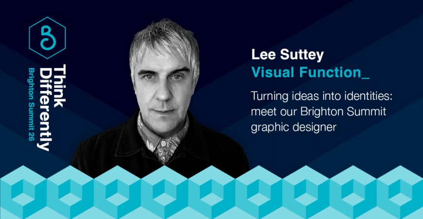
Meet Lee Suttey, the graphic designer behind Brighton Summit’s bold visual identity. Lee explains about the thinking behind this year’s Think Differently branding, how previous themes have come to life, and why the best creative ideas often start with a sketchbook and pen.
By Lee Suttey of Visual Function_
Hi Lee! Can you tell us a bit about who you are and what you do?
I’m Lee, as you know! I run a small graphic design agency called Visual Function, although when I say agency, it’s mainly me, along with a few trusted freelancers who bring their amazing skills in when I need them.
I’m what you’d call an all-rounder. I work across print, digital and motion, but I’ve always had a particular love of conceptual thinking, branding and typography. I’m also a published author and wrote and designed Sketching Type, a book all about encouraging people to create hand-drawn lettering and gain a better understanding of type and typography. A big part of the idea was getting people to pick up a pencil and start drawing again, which is something I feel even more strongly about now with the emergence of AI. I think there’s something really important about making marks yourself and getting away from the screen. I always start a project with a sketchbook and pen!
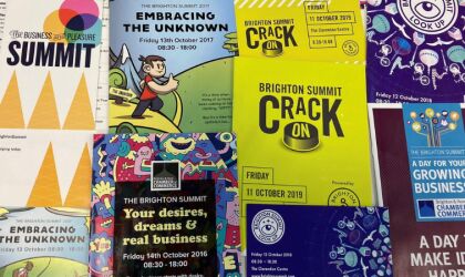
I love a good branding project, which is why I’ve enjoyed working with the Chamber on the Summit over the past few years. It’s always nice to actually attend an event you’ve worked on and see people interacting with the branding, whether that’s reading a programme you designed, seeing the graphics around the venue and up on the big screens, or everyone walking around wearing the branded lanyard!
You’ve been involved in Brighton Summit for a number of years – looking back to previous years, can you tell us a bit more about your approach for Human, 24/7 and What If?
Human
The theme for Human was actually one of my ideas. It was the 2023 Summit and I discovered through my initial research that there are 23 pairs of chromosomes in a human being. My mind instantly went to the patterns and structures you see in DNA and I could immediately see how this could become a really distinctive identity for the Summit.
I’d worked with the fab illustrator Sandra Staufer on the previous Summits, where we'd led with her distinctive illustration style, so Human was a big move away from that visually. I went for a much more scientific feel, with DNA-inspired patterns and a very muted colour palette that helped emphasise the nature of the concept.
24/7
Another one of my theme ideas! ;-) This one also came from the year of the event. 2024 led me to 24/7, which felt particularly relevant to a room full of people running businesses and trying to get their work-life balance right.
It was a positive idea, but there was also a question behind it: how do you actually get that balance right? I don't think many people are particularly good at it, especially when you're busy or working towards a deadline!
I had this quote from Will in About a Boy stuck in my head: “I find the key is to think of a day as units of time.” That became a starting point for an identity based around time, breaking it into sections and thinking about how we divide our days. The identity also worked with just the 24/7 part, which was really useful for some of the communications.
Because Human had been so muted, I wanted the following year to feel completely different. I gave myself the challenge of going right back to the fundamentals of colour in print and using just Cyan, Magenta, Yellow and Black, CMYK, to create a really vibrant identity.
What If?
Not one of my themes this time, but a great one! ;-)
With What If?, I spotted a visual connection between the question mark and the Chamber logo and thought, what if I broke one of the number one rules of branding and changed the logo? We also introduced a tagline created
by Rich at Sherlock, ‘Two words. Endless possibilities.’ It added something extra to the event name and became part of the wider branding.
From there, the rest started to work itself out. I went for a more textured visual style, with four supporting colours that worked alongside the Chamber’s brand colour and could be used to colour code the different parts of the day, such as keynotes and workshops. Again, I deliberately wanted it to feel completely different from the previous year.
I don't think I have a particularly distinctive design style, and I've never really wanted one. I have a certain way of thinking visually and developing an idea into a brand, the fun part is never knowing what the answer is going to look like when I start.
This year’s Brighton Summit theme is Think Differently. How have you applied that thinking to this year’s branding, and can you tell us about the story behind it?
Another great theme! I started by researching things that can be seen or thought about in different ways. This led me to the triadic cube, an optical illusion where your brain interprets which surfaces are in front and which are behind. Unlike a typical optical illusion that switches between two views, this one can reveal three: a cube with a carved-out void, a cube within a cube, or a form split into separate parts.
It seemed perfect for Think Differently because there isn't one correct way of seeing it. Your perception shifts depending on how you look at it.
If you wanted a corporate cliché to hook onto it, I suppose you could say it's about not only thinking outside the box, but within it too... but let's not go there, hey! ;-)
I hope people enjoy seeing it used to promote the Summit, but I'm particularly looking forward to seeing people interact with it on the day.
What does Think Differently mean to you?
I guess it sums up how I think creatives work at their best, and it's certainly how I like to think. Don't go into a project already knowing what the answer is going to be. Look at it from different angles, try things out and see where it takes you.
That's probably why this theme appeals to me. Thinking differently is pretty much what I've spent my career trying to do!
Have you any standout Brighton Summit memories?
I really enjoyed the Your Business Retold workshop by Asis Patel last year. I’ve designed many business cards in my time, so it was good to look at that simple piece of communication in a completely different way.
The quantum science hour at Sussex University was mind-blowing. Discovering different parts of the Dome on the tours has been ace too. The secret tunnel to the Pavilion had been on my to-do list for many years, so it was good to finally tick that one off!
Having a few drinks at the end is always a highlight too. It’s nice to catch up with old faces and have a proper chat with some of the people you’ve met during the day.
And anything you’re particularly looking forward to at this year’s Summit?
Being made to Think Differently, of course!
I’m looking forward to spending the day in the Dome. It’s perfect for the Summit, an iconic Brighton institution and such an amazing building to be in. I particularly love the boat-like ceiling in the Corn Exchange, and having been on a tour and heard about the renovation work at a previous Summit, I know just how much work went into getting it looking as good as it does now.
I’m also looking forward to seeing this year’s branding around the building and hopefully spotting a few people staring at the triadic cube branding, trying to work out exactly what they’re looking at!
Lee Suttey is the Creative Director at Visual Function. Find out more about them here.
You might also like:
If you want to contribute to the Chamber blog, contact us on hannah@brightonchamber.co.uk